Chalo Moca
SPAIN
www.chalomoca.com
IG: @chalomoca
FB: @fratellimoca
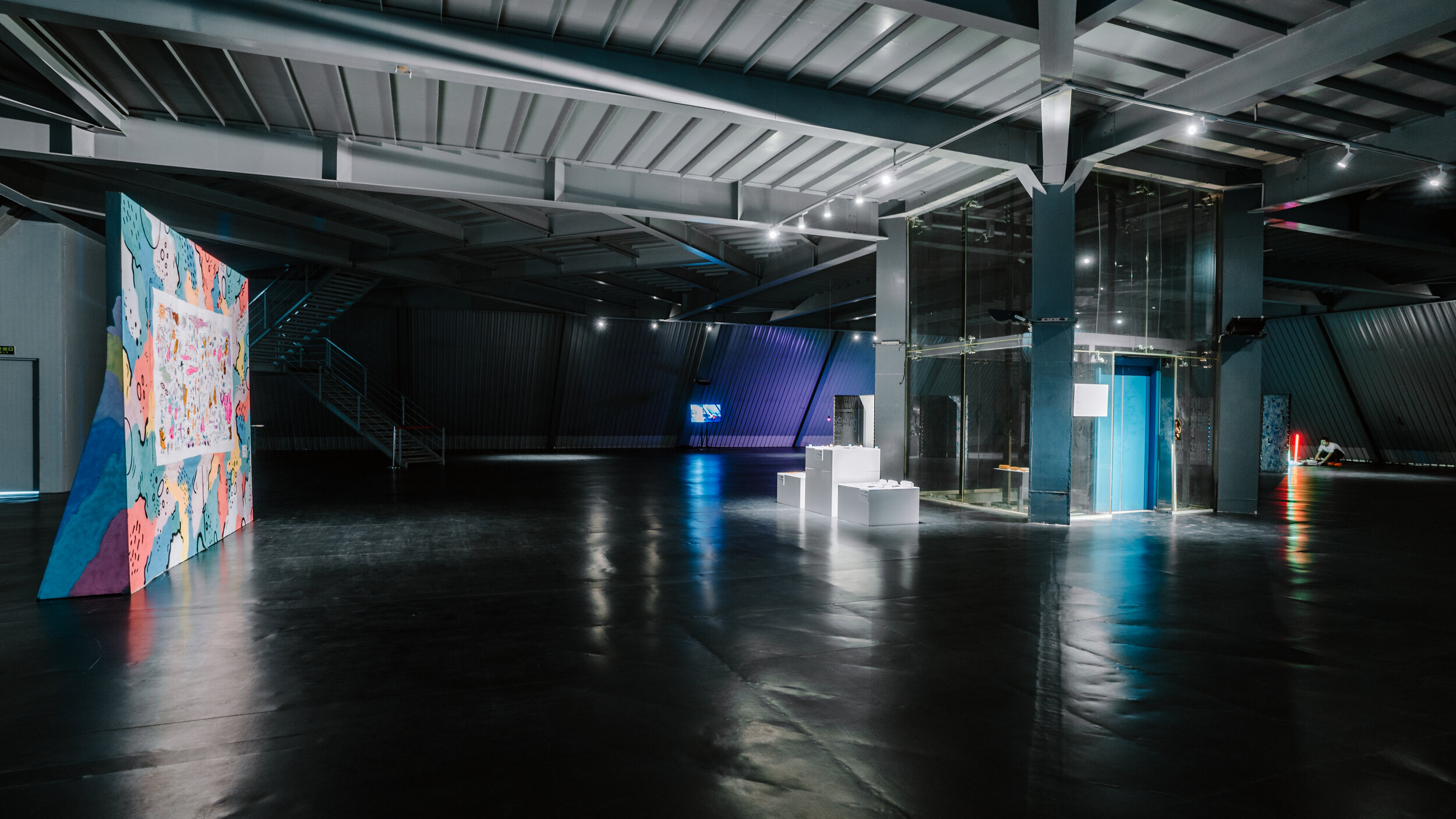
PLAN8T AIR SUMMER 2019
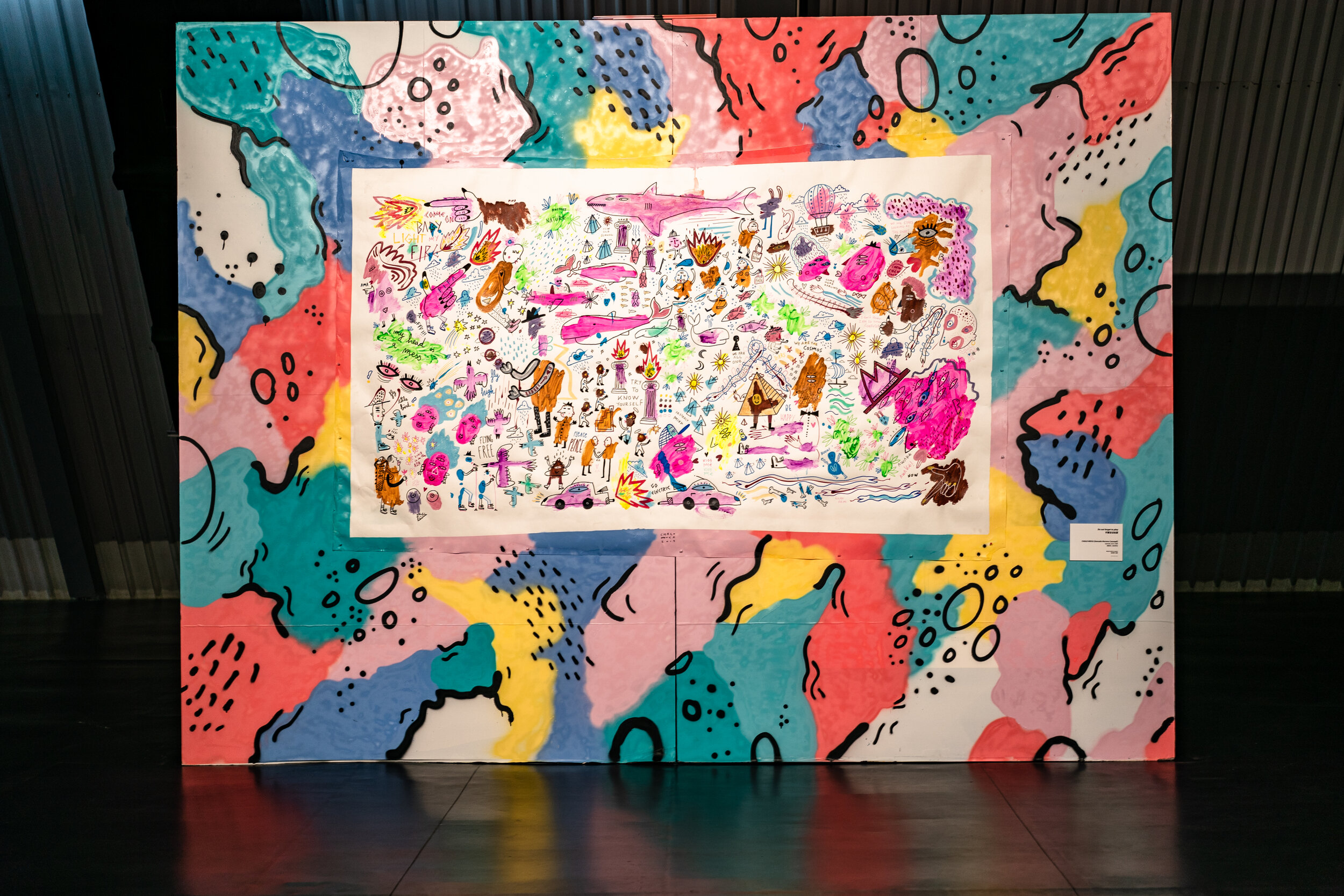
Human being, autodidact muralist and graduated as advanced technician in graphic arts specialized in illustration at the Arts School in Zaragoza.
He was awarded a scholarship and completed his studies in illustration in Milan. (He is also graduated in Economics)
When creating he likes:
- laying out simple images with content
- mixing up techniques, formats and styles
- exalting the unreal as a way out- glorifying the Nature and questioning humankind- playing with polysemy, symbology and visual rhetoric
His graphic style could be defined as a mix of urban art, expressionism, underground comic and art brut.
In 2009 he created with his brother Alva Moca the duo FRATELLI MOCA. Together they carry out a wide variety of projects and exhibitions. Individually, he has participated in a series of shows, both solo and collective.He has also participated in many Street Art festivals and live painting events. He gives workshops, specialized in mural painting for children. After working for several agencies, including working as an art director for DUDE Creative Agency in Milan, he now lives and works in Madrid as freelancer, mixing commercial and artistic works.
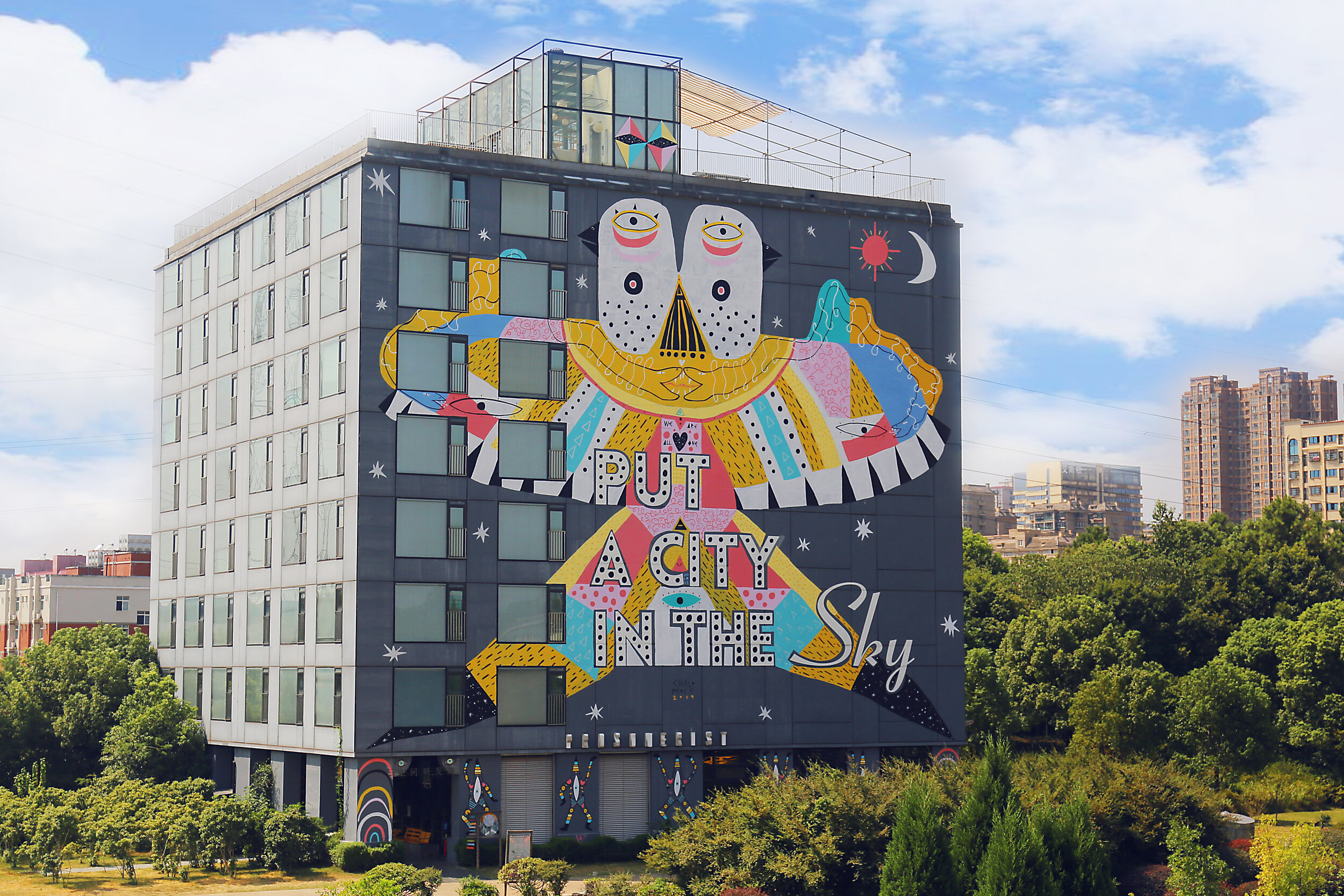
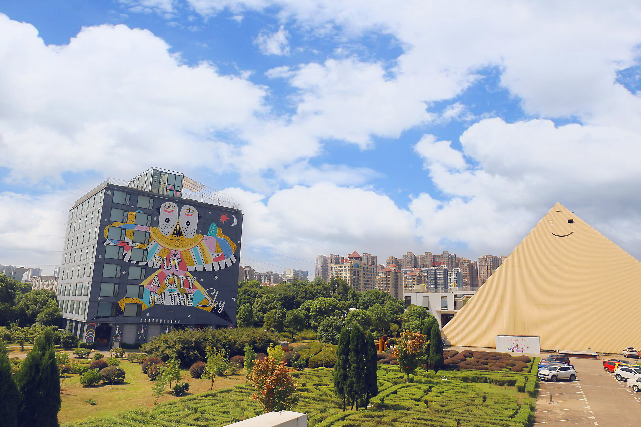
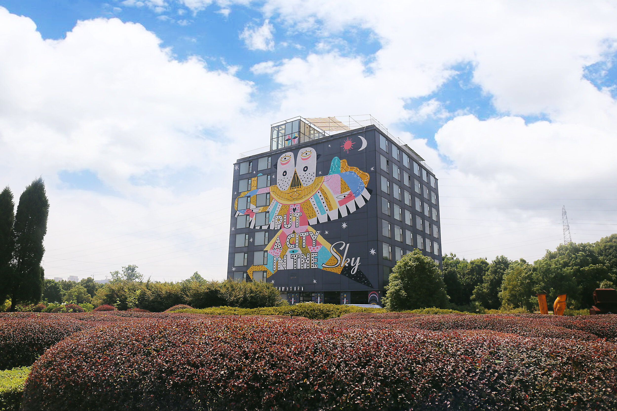
FAREWELL MY MAGIC KITE |
别了,我的魔法风筝
Mural on PLAN8T building
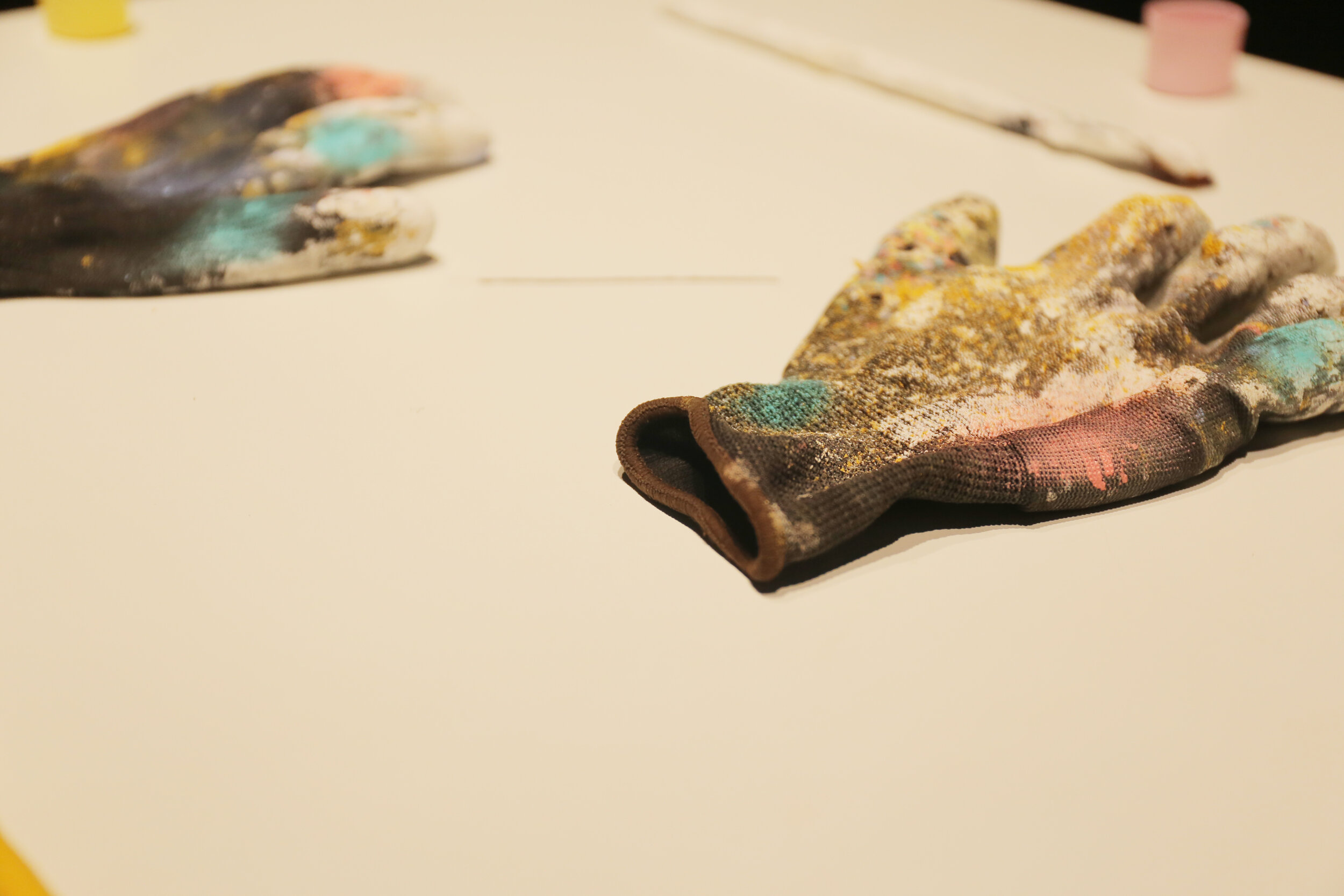
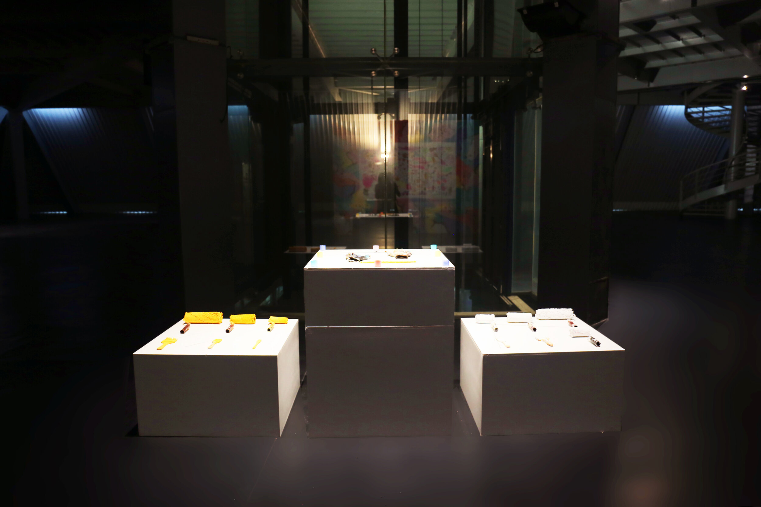
Time Lapse video of the art work
When he came to P8 his main purpose was to paint a big wall. Mission accomplished.
The sky and the cosmos are recurring themes in his work, so when he saw the phrase “PUT A CITY IN THE SKY” on the side of the main facade of P8 building, he knew this was where he wanted to paint his mural.
“FAREWELL MY CONCUBINE”, directed by Huaikai Chen, inspires his design for the mural. He was blown away by the film and how it felt both so hard and yet so soft at the same time. There was one particular scene where the children find some traditional Chinese kites. It inspired him to paint a kite, inspired by the traditional ones from the movie. Through his research he began to look at the different types of kites, he was really fascinated by how refined and complicated they were. His designs would occupy all of the space on the facade of P8 whilst also incorporating the existing text.
His intention was to use color and his own playful style to the wall, bringing joy to the environment of Broad Town. The colors used symbolize the Chinese fifth elements: grey (steel), blue (water and sky), ocre yellow (earth), yellow and pink (fire). For last black and white symbolized light and darkness. The kite also has two birds heads, symbolizing the dualism with which we live in our material world: good-bad, tall-short, black-white and day-night. In order to be more aware we, as humans, we have to try to understand that everything is one; as there is no light without darkness. Over the wings there are also two big snakes, that are kissing in the central part of the kite. (Love is so important) They have no tail, instead they have another head. Again, this symbolizes dualism.
To understand that there is some invisible energy that connects all of us. If we want to evolve as human beings, then we should accept that everything exists as a path that we have to walk. That is why, at the center of the kite there is a big heart (symbolizing love), filled with stars (symbolize the Cosmos) with the text “WE ARE ALL ONE”.
In the wings of the kite there also two big eyes, that make the image also appear as a big head of a magical being. His intention is to create an image filled other diverse images, images within images. Like the master Spanish painter Arlos Saura used to say: “I like to watch the mural, but I also want the mural watches us”